Brightchecker is a user-friendly application designed to streamline the property (and other types of) inspection process. It provides inspectors with a digital platform to create, conduct, and manage inspections, making the entire process faster, more efficient, and much simpler. To conduct the inspection you use our free property inspection app. You create, manage and report on inspections from the Brightchecker Dashboard.
To get jobs on and off the inspection app you will need a free trial or subscription
Easy-to-Use Interface
Brightchecker is designed with user-friendliness in mind. Its intuitive interface allows property inspectors to navigate seamlessly through the app, reducing the learning curve and ensuring a smooth user experience.
During the inspection, inspectors can effortlessly navigate through the checklist, marking them as compliant or non-compliant, and adding detailed notes or photos as necessary. The app also allows inspectors to capture digital signatures from property owners or occupants, ensuring documentation and accountability.
App Basics
- Install the app. It is a Progressive Web App (PWA). It offers a browser-based experience similar to a native app. There is no difference between a PWA and a native app from the viewpoint of the end user.
- Download inspection jobs from the dashboard.
- On the App select which inspection job you want to perform.
- And the main inspection screen appears.
The Main Inspection Screen
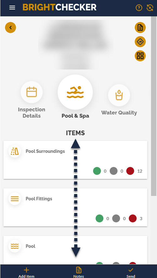
In simple terms there are three areas to the main inspection screen.
The top part of the screen shows your inspection job details i.e. address (we have blurred this out in the screen below).
The middle part of the screen allows you to see and move between the main sections of the inspection.
Each section is denoted by a meaningful icon and descriptive text.
Touch and drag the sections left or right to see more sections.
We have denoted this action with a red dotted arrow.

The bottom part of the screen shows items, each section has its own selection of items.
Every item holds a set of checklist questions.
Each item is denoted by a meaningful icon and descriptive text.
Touch and drag items up or down to see more items.
We have denoted this action with a black dotted arrow.

If there are lots of items then they will scroll to fill the entire screen.
Opening an Item
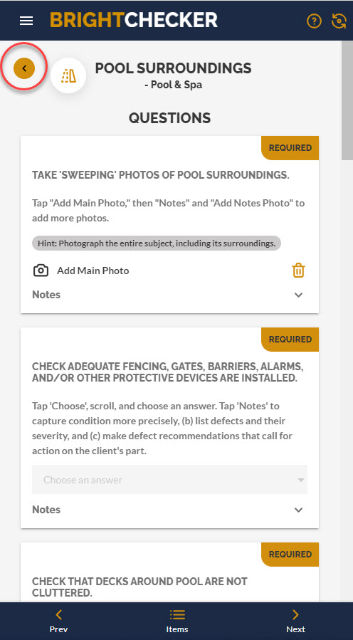
Tap on a item to see the checklist questions screen.
As a result the question screen appears.
- Respond to the questions.
- Touch and drag questions up or down to see more questions.
- Then tap on the back arrow at the top of the question screen to return to the main inspection screen.

We have denoted this action with a red circle in the screenshot above.
Send A Completed Inspection
To send a completed inspection back to the Dashboard make sure you have a good internet connection, and then tap ‘Send’.
We have denoted this action with a red arrow & circle in the screenshot below.

To Sum Up:
That’s it for this article, the interface really is ease and simplicity.
Next time we will take a look at the different question types available to you.
However, if you are super keen to learn more now check out our knowledge base video link below!
Free Trial
Get your Free Trial
Also Watch
Check out a Knowledge Base Video Here
Also Read
See more Helpful Content
Visit our Homepage

